
Notifications are noise. They can quickly become overwhelming for users.
Here’s a few tips to make your notifications matter.
Have a purpose.
This tip is a bit meta, but context is important to content.
You’ll need to answer these 3 whys:
- Why does the user need this message?
- Why would they care?
- What’s in it for them?
- What’s the value?
- Why do they need it right now?
- Is it time sensitive? (Is it really?)
- Can/Will they get this message any other way?
These are big picture questions that’ll guide your notification content.
Notice how none of these questions are about the business. Answer these questions honestly and selflessly.
Why does this matter?
Meaningless notifications either fall into the background or become a nuisance. They might be ignored. They might be turned off. Worst of all, your app might be uninstalled completely.
Good examples
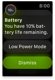
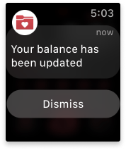
This is an obvious example from Apple Watch of a notification that has a clear purpose. If a user’s device has low battery life (why they would care) the user will want to know right away (why they need it right now) so they can plan to limit use and charge it when it’s possible (why they would care).
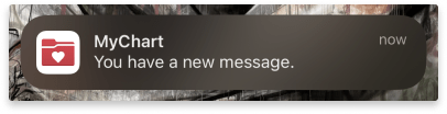
This notification from the MyChart patient portal app has a clear purpose. It ticks all the boxes. If a user is dealing with a medical concern (why they need it), they’ll want to know right away (why they need it right now) when their doctor messages them (why they would care).
Could Improve
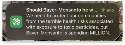
There’s a lot going on in this push notification. It’s dense and hard to read. It talks about a problem but isn’t clear on what it is. Key information is lost behind ellipses. It doesn’t give a reason for the user to care about it right now.
Most importantly, the user has no idea where it leads. When I tapped it (several weeks later) I thought I was opening an article.
Nope.
I was sent to a survey.
Let’s fix this:
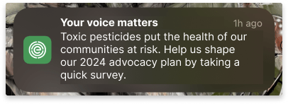
First, we’ve narrow the scope to give the message purpose.
Originally, it contained a reason to care, but we’ll make it concise. Then we give the user a reason to care about it today (it’s December 2023) and say the action we want them to take.
Be clear, concise, & useful.
Ah, the mantra of Content Designers everywhere.
Let’s break down what these mean.
To be clear is simply to get to the point in the most understandable way. Use plain language and phrases your audience would use. Avoid jargon and ambiguity.
Be concise because people don’t read, they scan. They look for key words to see if the message is valuable enough to give their full attention to. Choose words carefully and cut fillers. But never, never sacrifice clarity for conciseness.
Good notifications are useful. They give context, value, and an action. Without these, users don’t know why they’re being interrupted. See tip #1.
Good examples
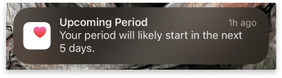
The cycle tracker feature in the iOS Health app is a great example of a notification that is concise without sacrificing the clarity and usefulness.
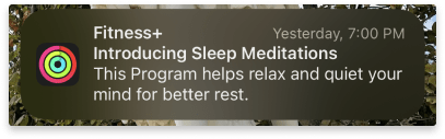
Fitness+ thoughtfully uses carefully chosen, heavy-lifting words to share news of a new feature. It balances clearly describing what the feature is and why it’s valuable. Interestingly, the usefulness is actually in the timing: 7:00 PM. This is when many people begin thinking about winding down for the evening.
Could Improve
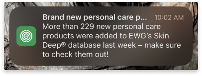
This notification from EWG’s Healthy Living app is long. The title gets truncated so it isn’t clear. The body repeats the title and could be trimmed out. It gives highly specific details about the internal database that don’t reflect how the user interacts with the app. The call to action can be shortened by cutting out filler words. Let’s rewrite this:
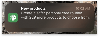
This message is much shorter while hitting the key points the user would want to know. The headline is concise, while the details about the number and type of new products are in the body. The body also includes the benefit to the user by using key words that would resonate with the audience.
Write with empathy.
Being concise doesn’t mean you don’t have the space to be kind.
You don’t have to use “please” and “thank you”. These are largely considered filler words in the content world.
Being transparent isn’t the same as being blunt. Being forward isn’t the same as being demanding. Being casual doesn’t mean passive-aggression or sarcasm are OK.
Sometimes kindness can be as simple as direct honesty.
Good Example
Finding out you’ve got bills to pay is the worst. This message is direct. It doesn’t beat around the bush or sugar-coat the news. There’s kindness in the neutral delivery.
Could Improve
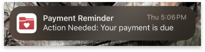
The phrase ‘Action Needed’ in title case makes this notification sound terse and demanding. The due date is looming, and the user needs to know, they don’t need to take this action in this moment. Maybe they can’t. The user gets this notification just after business hours. Perhaps that’s by design. However, it doesn’t consider what the user might be doing when they get it. Maybe they are driving home. Asking them to open the app and pay right now isn’t reasonable.
Let’s revise it:
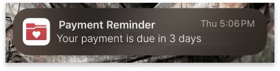
To make this more empathic, we’ll drop the “Action Needed” and add a timeframe, so the user doesn’t feel harried and they can get to it whenever they can.
This will require coordinating with the engineering team, but the infrastructure is already in place.
See?
Easy as pie.
Kidding. Writing push notifications is hard.
Fitting so much information in such a small space is a challenge, knowing the user will only spare a brief glance. It’s really got to pack a punch.
But getting it right is worth it.
Give it a shot!
Find a notification that you think could be improved (or let one come to you – the average smartphone user gets 46 app notifications per day), then try to improve it.
Let me know how it goes!
References
https://www.nngroup.com/articles/how-little-do-users-read/
Push Notifications Statistics
Interested in partnering? Let’s talk to see how I can help you create a comfortable digital health experience. Drop me a note at evy.haan@gmail.com.
Photo by Derick Anies on Unsplash
