3 more tips to connect with your users.
If you’ve missed it, check out part 1 of this series!
Watch your tone.
In addition to empathy, make sure the other aspects of tone match your message and aligns with your company’s voice and tone guidelines.
Good Example

Flo’s tone is casual and conversational. Their content design strategy allows for well-placed exclamation marks and emojis to communicate in their chatty, girlfriend-y, “get the 4-1-1” tone. This notification reflects that tone without detracting from the key message.
Could Improve
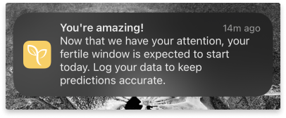
I’ll be honest: in my experience with the Ovia app, there doesn’t seem to be a consistent voice and tone. This message is even more bubbly than most other copy within the app. Let’s rewrite this to send the same message with toned-down energy:
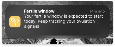
This isn’t to say that an upbeat tone is a bad thing (see Flo’s tone above). Rather it’s about a consist experience throughout the app. But even more importantly, it’s about not letting the tone and voice overshadow the main message.
Side note: Exclamation points are controversial. Ultimately, it comes down to how you craft your tone by what your user research suggests.
Make it personal.
Personalization is important to users. Even basic personalization in a push notification can increase engagement up to 10%. In fact, most people have come to expect it.
So, how do you personalize something in such a small space?
Individual tailoring goes beyond adding the user’s name to a broadcast notification.
Instead, try:
- Referring to personal goals or metrics the user has set within the app
- Sending helpful push notification based on their time, location, calendar, or activity
- Giving an update related to their content history
- Leverage behavioral or contextual triggers to nudge them to an action
Not all of these are appropriate for all apps or all occasions. Some may be divisive. Some may need to change over time and across generations. Stick to your user research and content design guidelines to decide the best push notification strategy.
Finally, whatever you do, don’t make it about you.
That should be obvious, but it can be hard to do when you’ve got a general broadcast or you just don’t have the data to tailor the message.
Keep the user in focus. Tell them the benefits. Make them feel like they’re more than a number for your metrics.
Good examples

This iCloud Calendar notification uses the user’s input of event date, time, current location and destination to tell the user when it’s time to leave if they want to make their destination on time. It adds a helpful tip about traffic – something the user didn’t ask for, but probably would be glad to know.

Here’s another example from apple podcasts. It succinctly lets the user know a show they’re subscribed to has a new episode. It includes the title of the show and the title of the episode
Could Improve
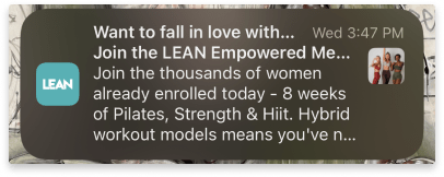
This general broadcast push notification is aimed at users who have downloaded the app, but haven’t signed up yet. The message spends more time conveying the app’s content and popularity than connecting with the user’s motivation. Let’s tweak it.
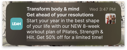
This packs a punch in terms of user benefits. A healthy body and mind? A head start on my new years resolutions? A pre-made program I don’t have to plan myself? AND 50% off? Sign me up!
It’s worth noting – all the information I used is true. It was sent in late September. The deep discount was likely the business’ motivation behind this push notification.
This is one example of the potential power of a collaboration between Content Design and Marketing teams.
Use the Headlines
And use them well.
This directly relates to the golden rule of content design: be clear, concise, and useful.
A push notification’s default headline is the organization’s name.
This is a missed opportunity.
If the user has only a glance to spare, the title can can do some serious heavy lifting. It can say what the message contains and convince the user it’s worth paying attention ASAP.
Keep it brief. Keep it useful.
Good example

The SharePlay feature while in a vehicle has to be succinct. ISO regulations have a strict max reading time for any in-vehicle features because of the dangers of distracted driving.
Right away, I know exactly what this notification is for. All the information I need to know is in the title.
Could improve

There may not be a lot to this message, but there can definitely be more. The headline space can be better used to tell the user what’s up. So let’s do that:

Here, a glance of the headline tells the user knows what the notification is about. Bonus, the user now gets even more out of the body copy.
(Just so you’re not confused: users in the community forums are assigned a randomly generated identity for every new conversation they join. This keeps participants anonymous.)
That’s it! For now…
I’m drafting one more article on tips to getting your message right in push notifications.
Until then, I’d love to know if these tips were new to you or a good refresher to content design strategy for push notifications.
:::
References
Push notifications best practices from TopTal
Push notification statistics from Business of Apps
State of the connected customer from Salesforce (pdf)
Interested in partnering? Let’s talk to see how I can help you create a comfortable digital health experience. Drop me a note at evy.haan@gmail.com.
Photo by Firmbee.com on Unsplash
