Content Designer | Concept work*
Onboarding experience update
Refining the feature promotion messaging for a more user-centric onboarding experience

Overview
The onboarding flow is a critical point in a user journey. In a feature-based onboarding experience, marketing meets UX to convince a user that this product will meet their unique need.
It must be short. It must be clear. It must be compelling.
In their Healthy Living app, the Environmental Working Group (EWG) highlights the most significant features in their feature-based onboarding flow. However, the case for why these features are so invaluable to the users isn’t made. With some content reframing, that connection can be made crystal clear.
The outcome may even be reflected in an increase in the conversion rate of more long-term, engaged return users.
Goal
Convince new users to become engaged return users by shifting the messaging focus of the onboarding content from features to values.
Results
There may be both short-term and long-term outcomes to this redesign.
In the short-term, users might understand the exact payoff for investing the time to set up, learn, and use this tool. They’ll be more convinced to sign up right away.
Because they can make that connection right away, they may also be primed to understand the long-term benefit of continued use, envisioning how it fits in their day-to-day. They may be more likely to be engaged return users.
Specific KPIs that may be affected are:
- Conversion rate
- Retention rate
- Daily, weekly, monthly active users
- Stickiness
- Churn rate
Implementation
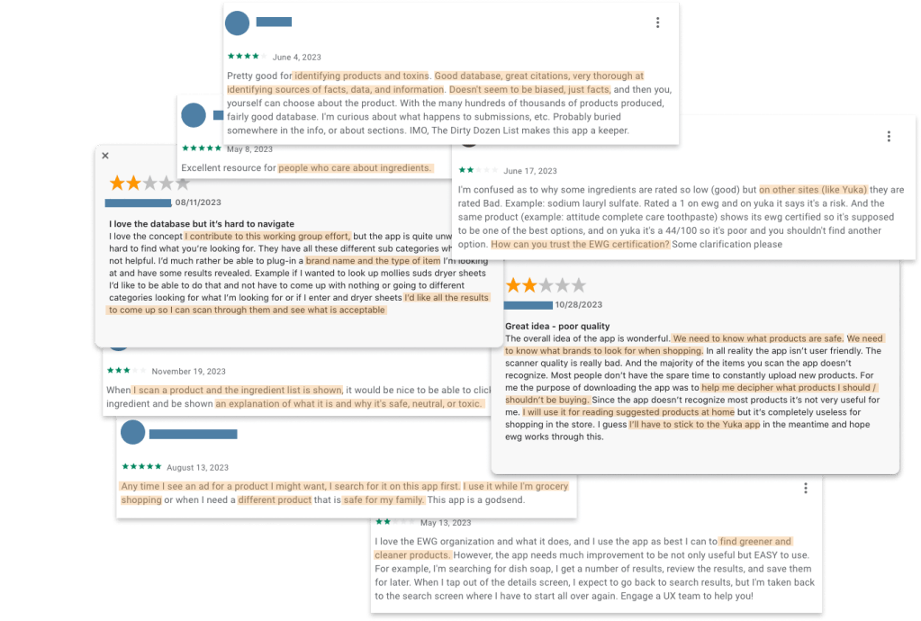
I started by reading reviews for the past year in the App Store and Google Play to get a sense of who was using Healthy Living. It helped me understand the user’s values, concerns, and motivations which helped me determine the right messaging to use.
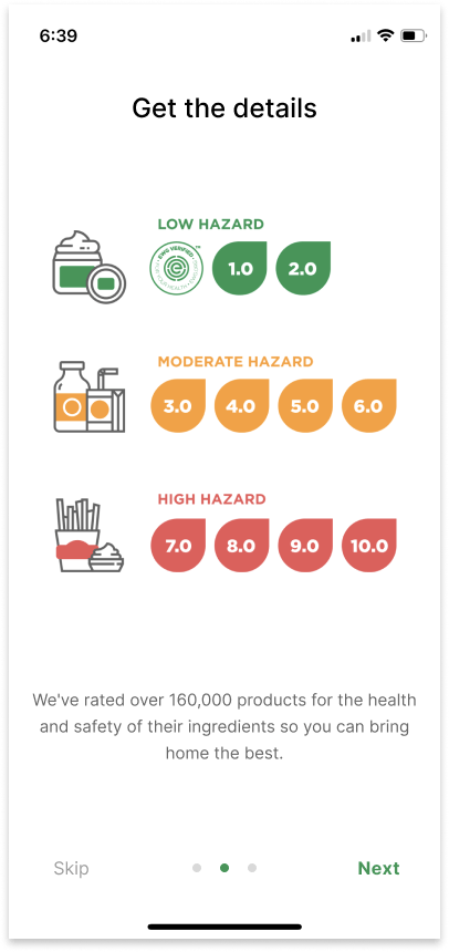
Then I took an inventory of what exactly the EWG wanted to promote about the Healthy Living app. These were:
- The combination of their 4 popular consumer product databases
- The easy, science-based product rating system
- The flexibility of how, when, and where a user can interact with it
These concepts are presented in terms of what EWG has done to create the specific features, what users can expect to see, or in some other way relaying the mechanics of the app.
For each idea, I asked 2 questions:
- What would the audience want to know about this?
- Why would they care?
After removing the interesting-but-not-essential details, I edited what remained to draw a clear and succinct connection between each highlighted feature and its value to the user.

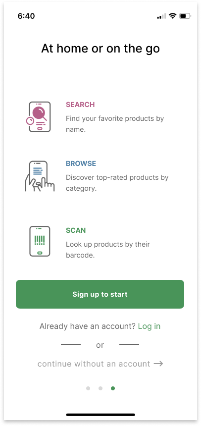
I also changed the progression indicators, adding the option to “skip” these onboarding screens.
Finally, I revised the login and sign up screens to ensure a smooth end-to-end flow through the entire onboarding process.
The log in and sign up process started with a single screen that stacked multiple SSO options together with “log in with email” and “sign up with email” options. There was microcopy on which to click to create a new account as well as additional screens if a user wanted to use their email to log in or sign up.
I redesigned these screens by cutting out the unclear multi-purpose screen in favor of expanding the discrete, separate login and sign up screens.


*Disclaimer
I am in no way affiliated with or have completed work for EWG. This is only to serve as a speculation of the impact of changes to the user experience. It does not reflect the constraints and limitations of the designers working on this product.
EWG, please view all covers here.
