UX Writer | Concept work*
Registration form update
Impacting KPI metrics with user experience and accessibility improvements

Context
Username and password form fields almost always add friction to new user registration because of the necessary requirements that ensure security. But as part of the early steps for converting visitors of a site or app into active users of the service, a smooth experience is critical.
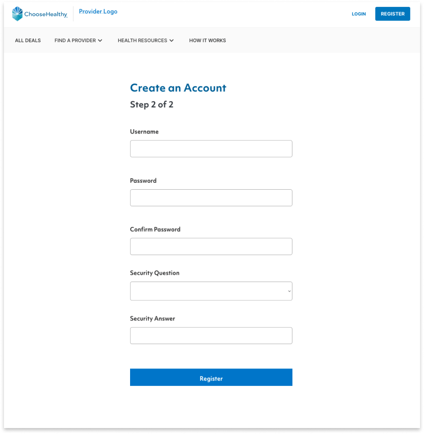
ChooseHealthy has a bare-essentials design for new user registration. The result is a clean, unintimidating user interface:

But minimalism here comes at a cost: a higher risk for user input errors. These occur due to hidden field requirements and a clunky password confirmation process.
A few tweaks to the UX copy might mitigate errors around these fields, improve the experience for new users, improve accessibility, and could have a big impact on several KPIs.
Goals
I would propose 2 changes:
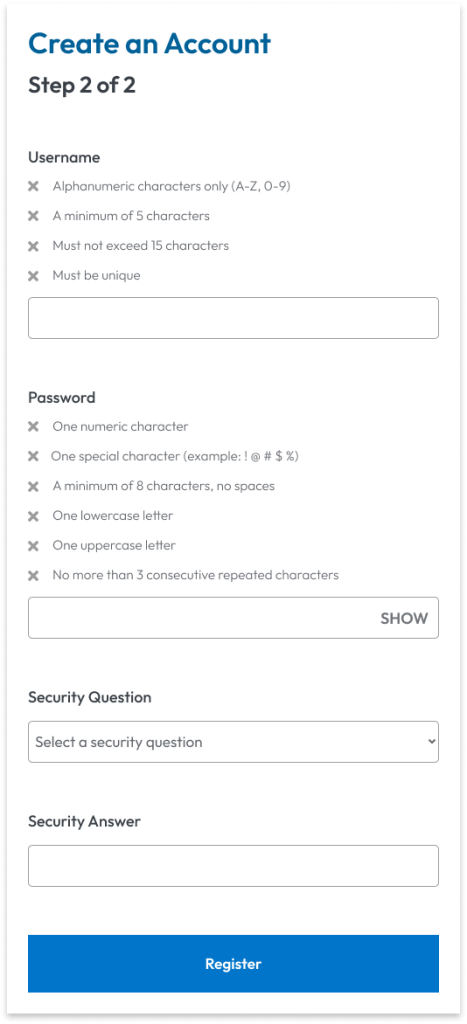
- Make field requirements visible
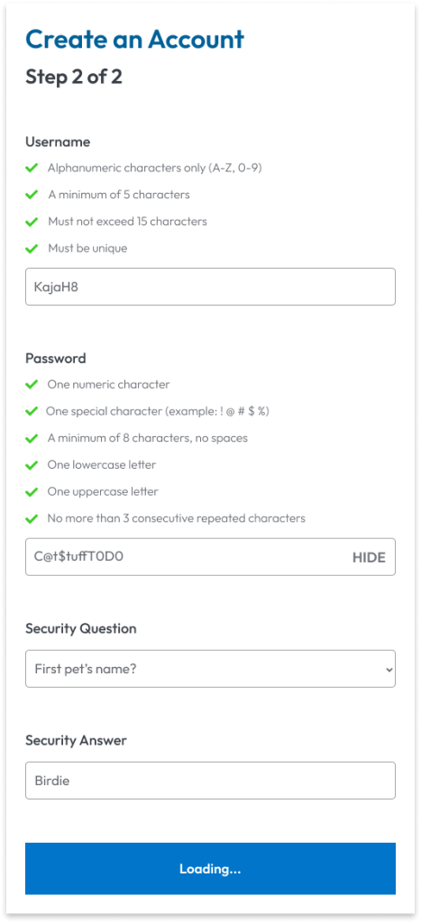
- Use a show/hide toggle for password confirmation
These changes free up the user to move faster through the registration flow with less risk of error.
Results
By making these changes, ChooseHealthy could:
- Reduce the User Error Rate (conversely, increase Task Success Rate)
- Shorten the amount of time a user spends in registration (Time-on-Task)
- Reduce the Abandonment Rate (conversely, increase the Conversion Rate)
- Improve the Customer Satisfaction Rate for the registration task flow
Implementation
Listing requirements above the form field means that by the time a user arrives at it, they understand what’s needed. Complementary visual cues also tell a user which ones they’ve met and which they still need to fulfill. Together, these changes remove the burden of remembering the requirements and checking they’ve been satisfied.


All the required information is now in a logical order for all users, whether they navigate by mouse/trackpad, keyboard-only, or screen reader. Visibility also means users with memory, attention, or other cognitive impairments, or even anyone who gets interrupted, has everything they need to move forward.
Giving the user a show/hide toggle to confirm their password keeps them in control. They can easily check their password before they submit the form.


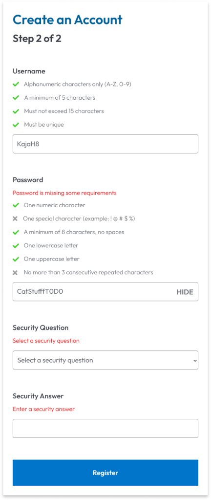
A final note would be the placement and content of error messages. Those are to be concise but informative, and placed after the field label but before any requirements. This way, no matter their preferred navigation means, users again have a logical order of getting the message, identifying the issue, and correcting it.
* Disclaimer
I am in no way affiliated with or have completed work for ChooseHealthy. This project was inspired by personal use of the product and serves only as a speculation as to the impact of certain changes to the user experience. It does not reflect the constraints and limitations of the designers working on this product.