
Content Designer | Concept work*
Enrollment for bonus features
Removing health plan verification frustration for cycle-tracking app users

Context
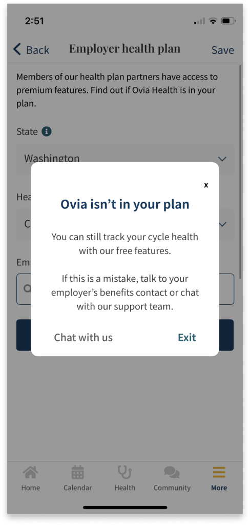
For users who end up in a less-than-optimal path, empathetic messaging can make bad news easier to receive.
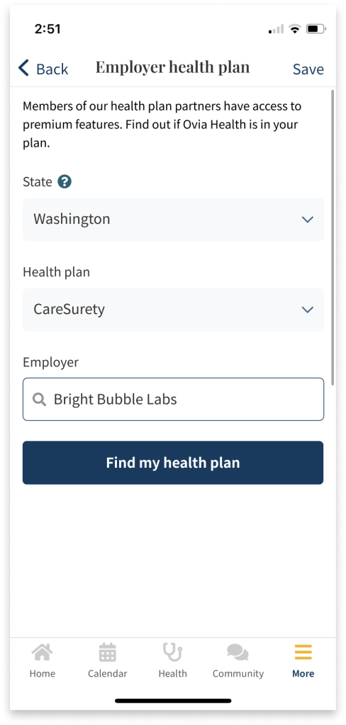
The Ovia: Fertility, Cycle, Health app offers premium features to users if their employers include Ovia Health in their health benefit plan. They only need to complete a verification check to find out if they are eligible and enroll.
For ineligible users, this brief form can become a frustrating experience. There are two reasons for this:
- There is no message letting them know they don’t need to complete the enrollment portion, even though there is automatic verification once all the eligibility fields are complete
- After finishing it, they are redirected out of the form without any message to let them know they are not eligible
Without feedback, these users may think the form is broken, the app is broken, the internet connection is broken, their enrollment request just needs time to process, or they may worry about the reliability of the app.
A content-driven solution can build on Ovia’s existing design patterns and development structures to create a better experience for users in these situations.
Goal
Reduce user frustration and show users their time is valued by delivering negative news directly and offering an exit from an unnecessary flow.
Results
A few metrics that might be used to inform KPIs may be:
- Number of times an ineligible user re-attempts the form in quick succession (Clickstream analysis or A/B test)
- Number of ineligible users that re-attempt the form in quick succession (Usability)
- Number of customer support tickets related to questions of ineligibility (Customer feedback)
To go one step further, clarifying this form can help the case in marketing to prospective partners. A streamlined form can give accurate data about how many users want these features but are ineligible.
Implementation
Using a dynamic form creates a natural separation point. The form would have 2 sections: eligibility and enrollment. All users complete the eligibility portion.
Users that are not eligible would be notified at this point that they are ineligible and they can exit the form. They may also choose to close the notification and return to the form, if they wanted to double check the details they entered. Or, they can open a chat with customer support in case there’s been a mistake and their employer does offer Ovia Health but the results don’t reflect it.
Otherwise, the form expands the enrollment portion for users who are eligible. This also gives these users more control. They can see if the option is available to them, but can decide later if they’d like to enroll.

* Disclaimer
I am in no way affiliated with or have completed work for Ovia or LabCorp. This project was inspired by personal use of the product and serves only as a speculation as to the impact of certain changes to the user experience. It does not reflect the constraints and limitations of the designers working on this product.
